Plots
Note
Ginga’s graph plotting features are new, and the API should be
considered somewhat experimental. In the future, some
elements of PlotAide might be merged into existing
components of the viewer or action bindings classes.
Ginga has some basic facilities for graphing interactive XY line plots. Ginga plots may be useful in cases where good interactive performance in a line plot is desirable (e.g. plotting an XY line repeatedly at speed), or being able to zoom in and out of X and Y axes independently, flip axes, swap axes or pan axes independently. There is some special support for plotting and examining time-series data.
Graphs are shown in a Ginga viewer and managed mostly by a separate
PlotAide object, which manipulates the viewer and its main canvas.
The plot aide is like a coordinator or intermediary between the
components of the plot. It initializes the viewer for special user
plot interaction and provides some coordination between XY plots and
other “plot decor” like plot title and key, axis titles, axis grids and
markers, etc.
Plot objects
Plot objects are available by importing classes from
ginga.canvas.types.plots. These classes are divided into “plot
decor”: plot title and key area (PlotTitle), X axis title, grid and
markers (XAxis), Y axis title grid and markers (YAxis), plot
background (PlotBG), etc. XYPlot objects (or subclasses
thereof) form the individual plot lines within the graph.
In typical use, the plot aide provides a convenience method
(setup_standard_frame) that can automatically add and configure the
plot decor, so that the user then simply needs to instantiate
XYPlot objects and add them to the plot via the plot aide’s
add_plot method.
Assuming that we have created and configured a CanvasView viewer
(v) with an associated ScrolledView widget (sw), we can
setup an empty graph (refer to
Using the Basic Ginga Viewer Object in Python Programs for a review of creating
a viewer and associated scroll widget):
from ginga.plot.PlotAide import PlotAide

aide = PlotAide(v)
aide.configure_scrollbars(sw)

aide.setup_standard_frame(title="Functions", x_title="x", y_title="f(x)")
To plot, simply call plot or plot_xy (depending on whether your
data points are together or in separate arrays) on each XYPlot
object that is present in the graph. Then call update_plots() on
the plot aide to update the viewer.
Let’s add two plots to this interactive graph:
from ginga.canvas.types.plots import XYPlot
import numpy as np

sin_plot = XYPlot(name='Sin', color='red', linewidth=2.0)
aide.add_plot(sin_plot)

cos_plot = XYPlot(name='Cos', color='blue', linewidth=2.0)
aide.add_plot(cos_plot)
Finally, let’s assign some data to the plots and update the viewer:
x_arr = np.linspace(-10.0, 10.0, 100)
y_arr = np.sin(x_arr)
sin_plot.plot_xy(x_arr, y_arr)

y_arr = np.cos(x_arr)
cos_plot.plot_xy(x_arr, y_arr)

aide.update_plots()
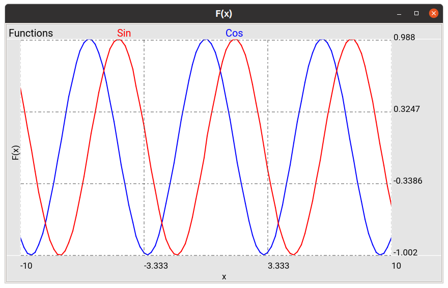
The plotted Sine and Cosine curves.
Support for autoscaling axes
The plot aide has two settings that control auto adjustment of the
viewer’s scale and pan positions when the view is updated (via
update_plots). The settings are intrinsic to the plot aide.
The values can be toggled by keystroke commands within the viewer, or
programatically by assigning the appropriate settings on the plot aide:
aide.settings.set(autoaxis_x='off', autoaxis_y='vis')
autoaxis_x
The setting for autoaxis_x controls how the viewer will handle the X
dimension as far as panning and scaling automatically when the view is
updated. The settings are:
off: the viewer makes no pan or scale adjustments to Xpan: the viewer pans so that the values at the end of the plot are visible; this is useful for live time-series plots, for exampleon: the viewer scales and pans so that the full X plot can be fit to the plot area shown in the viewer
The default value in the plot aide is on.
autoaxis_y
The setting for autoaxis_y controls how the viewer will handle the Y
dimension as far as panning and scaling automatically when the view is
updated. The settings are:
off: the viewer makes no pan or scale adjustments to Yvis: the viewer scales Y so that the Y values corresponding to the X values visible in the plot will fill the Y dimension of the plot areaon: the viewer scales and pans so that the full Y range of the data (visible or not) could be shown in the plot area of the viewer
The default value in the plot aide is on.
Interactive Viewer Operations on Graphs
For default bindings for interactive graph operations, see the “Plot” mode in the Ginga Quick Reference (Plot mode). The plot aide will initialize the viewer into Plot mode, so that it is continually ready for user interaction with the graph.
Zooming Graphs
Zooming on graphs is handled independently in the X and Y axes.
Mouse or touchpad scrolling is usually used to zoom the X axes.
Note that zooming will normally change any autoaxis setting to off
since you are overriding the setting.
See the Quick Reference link above for the cursor and key commands
in plot mode for zooming and changing the autoaxis settings
interactively.
Panning Graphs
Panning graphs is usually accomplished via scroll bars.
When used with a properly configured scroll widget (as shown in the
example above), the scrollbar aligned with the X axis becomes visible
when autoaxis_x becomes off.
Similarly, the scrollbar aligned with the Y axis becomes visible when
autoaxis_y becomes off. The scroll bars can then be used
independently to pan the graph in either axis.
Flipping and swapping
You can flip the X or Y axis and also swap axes, if it makes sense to do so. The usual key bindings for these can be found in the Ginga quick reference under the Transform commands (Transform commands).
Time Series Plots
Time-series plots are plots in which time is plotted on the X axis.
Ginga has some special support for these in the module
ginga.plot.time_series. There are classes for XTimeAxis,
TimePlotTitle, TimePlotBG that can be used in place of the
normal plot decor, and an XYDataSource that can be used to
efficiently keep track of a large fixed array of (x, y) points, from
which a XYPlot can be conveniently updated.
When using custom plot decor like this, you need to add it manually via
the plot aide’s add_plot_decor method, instead of using
setup_standard_frame:
import ginga.plot.time_series as tsp
from ginga.canvas.types.plots import YAxis

# our plot
aide = PlotAide(viewer)
aide.settings.set(autoaxis_x='pan', autoaxis_y='vis')

bg = tsp.TimePlotBG(warn_y=70.0, alert_y=80.0, linewidth=2)
aide.add_plot_decor(bg)

title = tsp.TimePlotTitle(title="Humidity (%)")
aide.add_plot_decor(title)

x_axis = tsp.XTimeAxis(num_labels=4)
aide.add_plot_decor(x_axis)

y_axis = YAxis(num_labels=4)
aide.add_plot_decor(y_axis)
The TimePlotBG class has support for a warning and an alert.
These are set when the current (last or right-most) Y value exceeds the
warn_y or alert_y values.
In the above example, the warning value is set to 70.0 and the alert
value is set to 80.0. The warning and alert levels, if set, are shown
by yellow and red lines in the plot background. Additionally, if the
current Y value exceeds the warning level then the background turns
yellow, as shown in the example application below; if it exceeds the
alert level then the background turns pink (alert takes precedence over
warning). If either warn_y or alert_y values are not passed, or
set to None, then there will be no warning or alert lines or
background color change in the plot.
For more detail on time series plots, see the example “plot_time_series.py” under the “examples/gw” folder.
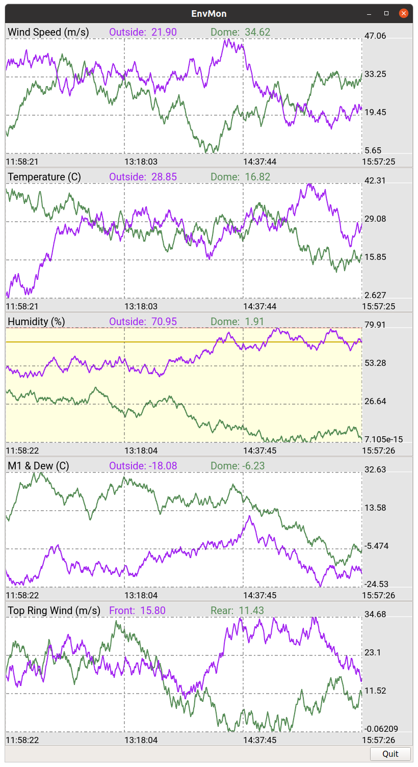
An example of time series plots with fake environment data. Each plot contains 86400 seconds (24 hours) of data points, and can be zoomed and panned interactively using the methods described in the Quick Reference link above.